Most modern web design projects can feel overwhelming, but with the right approach, you can create stunning and functional websites that resonate with your audience. You will discover how to incorporate seamless integrations to enhance user experience and streamline operations. From understanding your goals to utilizing effective tools, each of these dynamic steps will help you build a website that not only looks great but also performs flawlessly. For a deeper probe optimizing your workflow, check out this Website Development Process: Full Guide in 7 Steps.

Key Takeaways:
- Utilize responsive design to ensure optimal viewing across devices.
- Implement intuitive navigation for improved user experience.
- Incorporate modern UI/UX principles for enhanced engagement.
- Focus on performance optimization to reduce load times.
- Integrate APIs for seamless functionality and data exchange.
Understanding Modern Web Design
Modern web design emphasizes simplicity and functionality, creating visually appealing sites that are both user-friendly and engaging. Integrating 7 Dynamic Content Website Examples to Inspire You in 2025 can elevate your site by showcasing interactive elements and adaptive layouts that cater to diverse audiences.
Key Principles of Design
Effective design hinges on principles like balance, contrast, and hierarchy. Balance ensures that elements are visually appealing and lead the eye naturally across the page. Contrast highlights important areas, while hierarchy organizes content, guiding your audience from the most crucial points to the finer details.
User Experience (UX) Essentials
Prioritizing User Experience (UX) means focusing on how users interact with your site. This goes beyond aesthetics; it encompasses usability, accessibility, and emotional connection, making it vital for retaining visitors and converting them into customers.
To create a truly impactful UX, consider conducting user testing sessions where real users navigate your site. Tools like heatmaps can reveal where visitors engage most, enabling you to refine layouts and functionalities. Additionally, ensure your site is mobile-responsive; statistics show that over 50% of web traffic comes from mobile devices. Tailor your content accordingly, keeping load times under three seconds to prevent user drop-off. Incorporating intuitive navigation and clear calls to action fosters positive experiences and boosts engagement, vital for success in modern web design.

The Role of Responsiveness
Responsiveness in web design ensures that your site adapts seamlessly to various devices and screen sizes, enhancing user experience. A responsive design eliminates the need for separate mobile sites, allowing a single URL to provide optimal viewing on any device. Implementing responsiveness leads to higher engagement and lower bounce rates, ultimately boosting your site’s SEO. Statistics show that over 50% of web traffic now comes from mobile devices, making responsiveness not just a trend but a necessity for your design strategy.
Mobile-First Approach
Adopting a mobile-first approach means designing your website primarily for mobile users before scaling to larger screens. This strategy prioritizes vital content, ensuring that users have a fast and user-friendly experience on smaller devices. By focusing on mobile first, you cater to the growing number of users accessing your site via smartphones, improving the overall efficiency and performance of your design.
Adaptive vs. Fluid Design
Adaptive design uses predefined layouts tailored to specific screen sizes, while fluid design creates flexible elements that adjust proportionally to the screen dimensions. This difference impacts how users experience your site across devices. With adaptive design, distinct versions load based on the device type, whereas fluid elements stretch or shrink to fill available space, offering a more continuous experience.
Choosing between adaptive and fluid design depends on your specific goals and target audience. Adaptive design is ideal for those targeting distinct device types and requiring optimized experiences for each. For example, a retail site may benefit from specific layouts for tablets versus smartphones to enhance usability. Conversely, fluid design allows for a more consistent experience across various devices, making it easier to maintain and manage. Brands like Bootstrap advocate fluid design principles, providing a responsive grid that simplifies development while ensuring aesthetics remain intact across devices.
Integrating the Latest Technologies
Stay ahead in modern web design by integrating the latest technologies. Adopting cutting-edge tools and approaches not only enhances user experience but also streamlines your development process. By embracing innovations in AI, machine learning, and responsive design, you ensure that your website remains relevant, interactive, and efficient to meet your users’ evolving needs.
Embracing APIs
Using APIs is vital for connecting your applications with other services seamlessly. They enable your website to incorporate functionalities such as payment processing, data analytics, and social media sharing, enhancing the overall user experience without extensive coding. By implementing APIs, you can create a more interconnected and dynamic web presence.
Leveraging Frameworks
Frameworks can significantly accelerate your development process and improve the functionality of your website. They provide a structured foundation and pre-built components, allowing you to focus on customization and unique features. Popular choices like React and Angular enable rapid deployment, easier maintenance, and better performance, catering to diverse project needs.
When you choose frameworks like React or Vue.js, you gain access to rich ecosystems filled with libraries and tools that enhance your workflow. These frameworks prioritize component-based architecture, which leads to reusability and efficiency in coding. For instance, with React’s virtual DOM, updates are optimized for speed without compromising performance. Consequently, you can deliver a responsive design while ensuring that your website runs smoothly across various devices and platforms. This approach not only saves time but also results in a consistently high-quality user experience.

Streamlining Workflows
Streamlining workflows involves enhancing efficiency through organized processes and effective tools. By optimizing your design pipeline, you can significantly reduce time spent on revisions and ensure that your team stays aligned. Consider examining resources like 1 CHAPTER 1 THE MODERN WEB DESIGN PROCESS for insights on refining your methods.
Collaboration Tools
Utilizing effective collaboration tools can transform team dynamics and project outcomes. Platforms such as Slack, Figma, and Trello allow for real-time communication and feedback, promoting transparency and faster decision-making. By integrating these tools, you ensure that everyone is on the same page, which enhances teamwork and ultimately improves your design effectiveness.
Version Control Best Practices
Adhering to version control best practices is imperative for maintaining a clean workflow. Using tools like Git allows you to track changes and collaborate more efficiently. By creating distinct branches for features, you prevent conflicts and streamline code merges. Regular commits with clear messages ensure everyone understands updates, reducing misunderstandings and guiding project development smoothly.
Implementing version control involves several best practices. Always commit your changes frequently, ensuring each commit represents a single, coherent update. This makes it much easier to troubleshoot issues that arise later. Use branching effectively; feature branches allow for isolated changes that can be reviewed before merging into the main codebase. Finally, maintain clear and concise commit messages, as they provide context about what changes were made, facilitating smoother collaboration and clearer project histories.
Enhancing Performance
Enhancing your website’s performance is vital for retaining visitors and improving search engine rankings. A fast-loading site significantly impacts user experience, leading to higher engagement and conversion rates. Utilize efficient coding practices, minimize HTTP requests, and employ dynamic loading techniques to create a seamless browsing experience that keeps users coming back.
Optimization Techniques
Implementing effective optimization techniques is vital for driving speed and efficiency. Compress images, leverage browser caching, and combine CSS and JavaScript files to reduce load times. Tools like Google PageSpeed Insights can help identify areas for improvement, ensuring your website runs smoothly, even under high traffic.
Content Delivery Networks (CDNs)
Content Delivery Networks (CDNs) significantly enhance web performance by distributing your content across multiple servers worldwide. This decentralization reduces latency and speeds up the delivery of resources to users, regardless of their geographical location. By pulling content from the nearest server, CDNs minimize loading times and provide a more responsive experience.
Content Delivery Networks (CDNs) play a transformative role in modern web architecture. With the ability to decrease loading time by up to 50%, CDNs cache content close to your users, dramatically enhancing site speed. Leading providers like Cloudflare and Akamai maintain a vast network of servers, ensuring that your content is always delivered efficiently. The scalability offered by CDNs also accommodates spikes in traffic, preventing service interruptions and keeping your site accessible at all times.
Conclusion
Upon reflecting on the seven dynamic steps for modern web design and seamless integrations, you can see how these strategies empower you to create a user-friendly online presence. By implementing these steps, your website will not only look great but also function effortlessly, providing an enjoyable experience for your visitors. Embracing innovation and staying adaptable will ensure your web design remains relevant and effective in today’s fast-paced digital environment.
FAQ
Q: What are the 7 dynamic steps for modern web design?
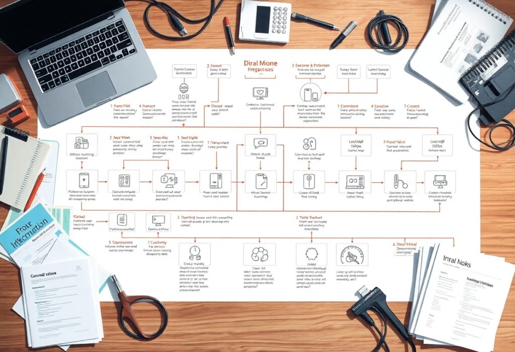
A: The 7 dynamic steps for modern web design include: 1) Define Objectives, 2) Research Target Audience, 3) Create Wireframes, 4) Design Visual Elements, 5) Develop Functional Prototypes, 6) Test Usability, and 7) Deploy and Iterate. Each step builds upon the previous to ensure a user-friendly and visually appealing website.
Q: How does effective integration improve web design?
A: Effective integration allows various tools and functionalities to work together seamlessly, enhancing user experience. This includes integrating content management systems, analytics, and social media, making the design more interactive and informative for users.
Q: What role does user research play in web design?
A: User research is vital as it provides insights into the preferences and behaviors of the target audience. Understanding user needs helps designers create more tailored, relevant, and engaging web experiences that meet user expectations.
Q: Why is testing usability an important step in web design?
A: Testing usability ensures that users can navigate and interact with the website without difficulties. It identifies issues and areas for improvement, helping refine the design before final deployment, resulting in higher user satisfaction.
Q: How often should a website be updated after deployment?
A: A website should be regularly updated based on user feedback, technological advancements, and changes in business objectives. Regular updates help maintain functionality, relevance, and security, ensuring that the website continues to meet user needs.