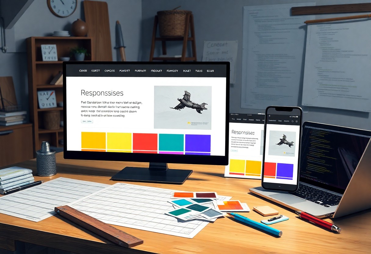
This guide will help you create a responsive web design that adapts seamlessly to any device, ensuring a great user experience. By implementing flexible grids, images, and CSS media queries, you can make your website attractive and functional. It’s vital to stay updated to maintain relevance, making your brand accessible to a wider audience. For more insights, check out How To Make a Responsive Website: Beginner’s Guide to kickstart your journey.
Key Takeaways:
- Understand the importance of fluid grids, which allow seamless resizing of layout elements across different screen sizes.
- Utilize flexible images and media queries to ensure that visuals adapt appropriately to various devices.
- Prioritize mobile-first design by developing the mobile version of a site before expanding to larger screens.
- Test your design across multiple browsers and devices to ensure consistency and functionality.
- Maintain a streamlined user experience by optimizing loading times and minimizing unnecessary elements.
Understanding Responsive Web Design
In today’s digital landscape, responsive web design ensures your website provides an optimal experience across a variety of devices, including desktops, tablets, and smartphones. By using flexible grids, layouts, and CSS media queries, you create a seamless user experience that adjusts according to screen size, orientation, and resolution. This adaptability not only enhances usability but also boosts your site’s visibility on search engines.
What is Responsive Web Design?
Responsive web design is the practice of crafting websites that dynamically resize and reorganize content according to the user’s device. Employing fluid grids and media queries, it allows you to create a single site that adjusts elements like images and text, ensuring accessibility and functionality on any device. This approach eliminates the need for multiple, device-specific versions of your site.
Why It Matters for Modern Brands
Embracing responsive web design is vital for modern brands aiming to engage customers effectively. With over 50% of web traffic originating from mobile devices, using a responsive design can enhance user engagement and reduce bounce rates. Brands that prioritize mobile-friendly experiences often see an increase in conversion rates, leading to improved sales and customer loyalty.
In today’s competitive market, a responsive design serves as a powerful tool for maintaining relevance. Companies like Starbucks and Amazon have harnessed the benefits of responsive design, resulting in higher customer satisfaction and increased revenue. By neglecting to implement a responsive approach, your brand risks losing potential customers who face frustration on non-optimized sites. Investing in responsive web design not only boosts visibility but also provides a competitive edge in delivering a consistent, high-quality user experience across all platforms.
Key Factors for a Successful Responsive Design
Creating a responsive web design hinges on several key factors that ensure your site performs exceptionally across devices. Focus on fluid grids, flexible images, and media queries to establish a seamless, adaptable layout. These elements work together to provide a user-friendly experience, regardless of screen size. Any misalignment in these factors can derail your design objectives.
Fluid Grids
Fluid grids allow your layout to resize smoothly, maintaining proportionality regardless of the device used. This adaptability is vital for a consistent user experience. By using percentages instead of fixed units for widths, you can ensure elements shift harmoniously across varying screen sizes while retaining their visual hierarchy.
Flexible Images
Flexible images adjust according to their containing elements, ensuring visual integrity across devices. Using CSS properties like max-width: 100% allows images to scale without losing quality. This approach not only enhances aesthetics but also improves load times, a crucial aspect in today’s mobile-first world.
Implementing flexible images involves sourcing high-quality images optimized for web usage. By utilizing formats such as JPEG, PNG, or even SVG for graphics, you ensure images remain sharp and load efficiently. Furthermore, consider using responsive image techniques like srcset for delivering appropriately sized images based on the user’s device, enhancing performance and user experience.
Media Queries
Media queries enable tailored CSS rules for different screen sizes, facilitating a customized design experience. Using breakpoints, you can control how your site appears on various devices, ensuring critical elements are visible and functional.
They operate by applying specific styles based on characteristics like screen width, height, and resolution. Implementing media queries wisely allows you to adapt layouts, fonts, and images consistently as the viewport changes. For instance, you might set rules to adjust navigation menus or hide certain sections to optimize usability on smaller devices, thereby enhancing overall accessibility.
How-to Design for Different Devices
When designing for various devices, consider how your audience interacts with their screens. Each device offers unique constraints and opportunities, so tailoring your approach is vital. Adopting responsive web design principles allows you to create a seamless experience across all platforms. For a deeper dive, check out The Beginner’s Guide to Responsive Web Design (Code ….
Mobile-First Approach
Starting with a mobile-first approach means designing your site primarily for smaller screens, then scaling up for larger devices. This strategy ensures that vital features remain accessible and functional, enhancing user experience on mobile without sacrificing quality on desktops.
Embracing Breakpoints
Breakpoints are the points at which your layout adjusts to accommodate different screen sizes. Implementing breakpoints correctly allows your design to adapt seamlessly without compromising usability or aesthetic. Utilize CSS media queries to define these breakpoints, providing a tailored experience as users switch between devices.
By effectively embracing breakpoints, you can create a fluid design that responds to various screen widths. For instance, establishing breakpoints at common screen widths, such as 320px for mobile and 768px for tablets, allows you to adapt your layout. This ensures key elements, such as navigation and call-to-action buttons, remain user-friendly regardless of the device. Evaluate analytics regularly to determine optimal breakpoints based on your audience’s behavior; refining these will enhance your site’s performance significantly.
Tips for Creating Engaging Content
Creating engaging content is necessary for capturing your audience’s attention and encouraging interaction. Focus on storytelling to weave your brand message creatively, utilize visuals effectively, and incorporate calls to action that guide visitors. Ensure that your content is tailored to different user preferences by varying formats, such as videos, infographics, or articles. Regularly analyze user engagement and adjust your strategies accordingly. Assume that incorporating diverse content types will enhance your audience’s experience and foster loyalty.
Simplifying Navigation
Simplifying navigation is vital for enhancing user experience on your site. Ensure that menus are intuitive, with clear labels that guide visitors effortlessly to their desired location. By limiting submenu options, you reduce user frustration and further enhance mobile responsiveness. Incorporating breadcrumb trails can also assist users in understanding their current position within the site hierarchy, improving overall satisfaction.
Prioritizing Readability
Prioritizing readability means ensuring that your content is easily digestible. Use concise sentences and avoid jargon that might alienate readers. Choose a font size and style that enhances clarity on both mobile and desktop views. Employing appropriate line spacing and contrasting colors also contributes to a more pleasant reading experience. Keeping your paragraphs short aids in retaining attention and encouraging further engagement.
To prioritize readability effectively, consider applying the Flesch-Kincaid readability test to evaluate your content’s complexity. Aim for a score that indicates your text is suitable for a broad audience; typically, a score around 60-70 will cater to a general readership. Use subheadings to break up text visually and guide readers through your content. Additionally, incorporating bullet points can highlight key information, making it easier for readers to scan. Since most users skim content, integrating these strategies will enhance user retention and encourage deeper engagement with your brand.
Testing Your Responsive Design
Evaluating your responsive design is important to ensure it delivers a seamless user experience across all devices. Testing helps identify any inconsistencies, layout issues, or functional defects that could hinder engagement. By conducting thorough tests and focusing on key metrics like load times and usability, you can fine-tune your design for optimal performance.
Tools for Testing
Utilize various tools to assess your responsive design effectively. Google Chrome DevTools allows you to simulate different devices directly in your browser, while BrowserStack lets you test across real devices and browsers. Tools like Responsinator also provide straightforward visuals of how your site appears on multiple screen sizes.
Common Pitfalls to Avoid
Avoid oversights that can detract from your site’s responsiveness. Ensure that media queries are used accurately and consider how images scale-large files can slow load times on mobile devices. Additionally, neglecting to account for touch interactions can lead to frustrating user experiences.
One common pitfall involves ignoring touch targets, which can make navigation cumbersome on touch devices. Ideally, buttons should be at least 44×44 pixels to ensure usability. Failing to optimize assets-like images and scripts-can also slow down load times for mobile users. Regular testing should involve not just visual checks but also functional tests to ensure all interactive elements work as intended. By addressing these areas early, you can enhance the overall efficiency and effectiveness of your responsive web design.
Summing up
From above, you can see that building a responsive web design is key to enhancing user experience and boosting your brand’s online presence. By prioritizing adaptable layouts and flexible images, you ensure your site looks great on any device. Embrace a mobile-first approach, test across various screens, and continually optimize based on user feedback. By applying these strategies, you’re not just keeping up with trends but creating a welcoming digital space for your audience. Start honing your skills today, and watch your brand thrive in the modern digital landscape.
FAQ
Q: What is responsive web design?
A: Responsive web design is an approach that allows websites to adapt their layout and content based on the size of the user’s screen. This ensures optimal viewing and interaction across various devices, from desktop computers to mobile phones.
Q: Why is responsive web design important for modern brands?
A: It enhances user experience by providing consistent and accessible content on all devices. This leads to higher engagement rates, better SEO performance, and improved brand perception.
Q: What are the key components of responsive web design?
A: Key components include flexible grid layouts, fluid images, and media queries. These elements work together to create a seamless transition between different screen sizes.
Q: How can I test the responsiveness of my website?
A: Use tools like Chrome DevTools, BrowserStack, or responsive design testing websites. These tools allow you to check how your website looks and performs on various devices and screen resolutions.
Q: What are some common mistakes to avoid in responsive web design?
A: Common mistakes include not optimizing images for different screen sizes, relying too heavily on fixed layouts, and neglecting mobile loading speeds. Ensuring a performance-focused approach can enhance the overall design experience.


